|
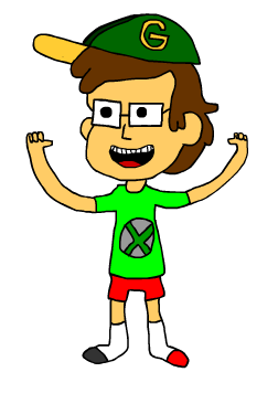
Cartoon Self
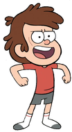
This is what I would look like this. The animation style chose was the Gravity Falls animation style. The reason I chose this style is because i greatly enjoy the show and like the smooth animation style. I feel like the picture was a success. It was what i wanted to make.
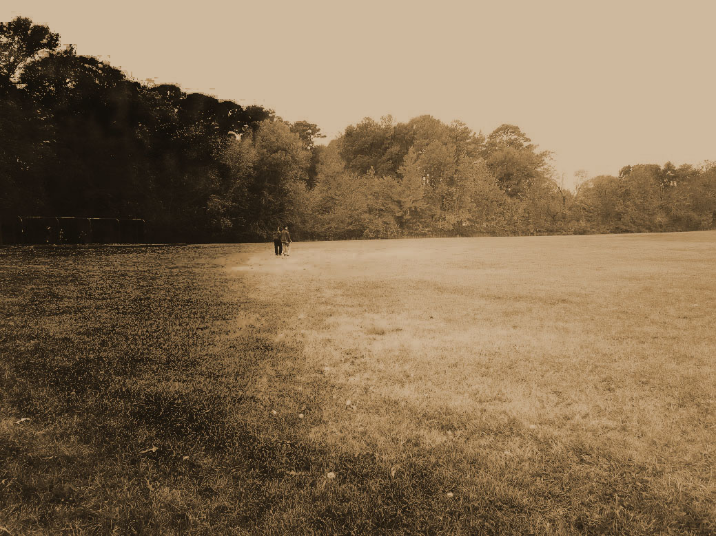
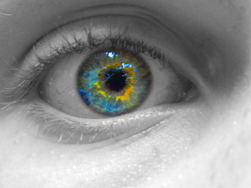
These are 2 of the photos I took for my photography unit in computer art. The 2 techniques I used (left to right) are sepia and emphasis. for the sepia i added a burn effect to show the eye something more interesting, and to give it some emotion. for emphasis i wanted to who the cameraman (me) in the eye. that did not work so i changed the color of the eye. Gorizord
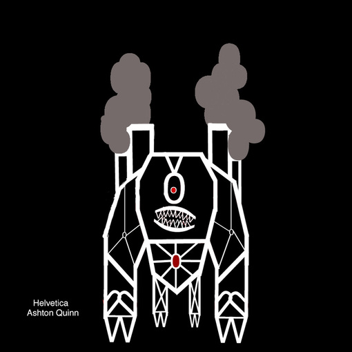
I used mostly I's O's and V's in the project. If my fontbot magically came to life, it would be found in a ruined city after a war. The colors make the project feel dark and brooding to me. This is what goes on in my head. It symbolizes that I have basically two sides of myself. I am usually happy and fun but can but can be a huge meanie. Here is what each thing represents; Pie= My love of sweets Nyan Cat= My love of memes and the internet. Mother and Father= My love for them. Pistol= My killing hobby. (for animals) Slender Man= My love of scary things. He is the Rake. |

|
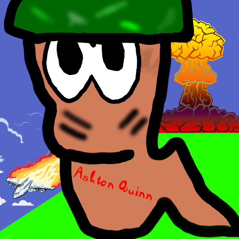
Splosion Worm!
I made this piece using a Walcom bamboo tablet to draw in the photoshop application. it is a more detailed and in depth version of a basic worm character in the game. I chose this particular picture because I had played the game worms a lot in my video gaming days, so I wanted to do a project on it. I think one of the most predominant elements and principles of this art piece is lines. I enjoy this piece of art because the clash of nature and urbanization is beautiful and sort of relates to the world and how we treat the environment today.If you want more art from this artist? Click on the picture for a link!
|
